PEMCO Insurance is currently experiencing a renaissance, bringing levels of service to its customers that they’ve never before seen. In my short tenure (4.5 years) at PEMCO, we’ve added online access to policies, amendments, payment plans, documents, the ability to go paperless, an any-device responsive website, iOS and Android apps, among other fast and efficient features that provide direct access to PEMCO and their products.
It’s all quite exciting on the surface, but there’s also a ton of moving parts under the hood. Internal applications that drive the business and feed data to various systems are being retooled to be the most effective they can be. These challenges arrive at my desk in the form of usability and interface design tasks.
As all of these internal apps do different things and serve multiple departments, their connection to PEMCO can get off-the-rails a bit. Brand styles and patterns start to look and behave completely different depending on where you work. PEMCO has recognized this issue and has moved to adopt not only the organization’s brand standards, but also to go further and agree on digital style standards to bring its many tools into familiar territory, allowing users to get working rather than wasting time getting accustomed to new user interfaces when they switch apps.
My team took to the task and produced a style guide that was very well received by PEMCO in a short period of time. The (soon to not be) secret to our success lies in these lessons learned:
– Keep your audience in mind at all times
Take shortcuts in your writing when you can assume your readers already understand a concept, but always keep asking yourself if your audience will comprehend and be comfortably guided by what you’re trying to communicate.
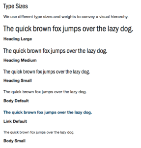
 An example is PEMCO’s type sizes. We wanted to present the look and feel of various styles of type very quickly without being bogged down with explicitly outlining each pixel size and font weight (the H1 is 20px, the H2 is 16px, the H3 …). Relying on the audience’s knowledge (developers) to inspect the document for CSS specifics, this approach worked for both tech and non-tech inclined and we found our audience’s sweet spot for detail.
– Fonts and colors are great, but what your developers need are patterns.
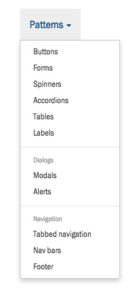
 Style guides of the past have been heavy on fonts, colors, and logo treatments. While still important, these things are a given necessity. The real meat and potatoes lies within components; common U.I. elements, how they’re used, and how they’re styled.
– Adopt a framework to fill in the gaps
![]() You may not come up with every pattern in a style guide. A framework can not only jumpstart your guide, but it can also offer excellent ongoing, “further reading,” if new and exciting U.I. concepts arrive in the future. I’ve relied on Bootstrap several times for this purpose. There are many other frameworks to consider.
You may not come up with every pattern in a style guide. A framework can not only jumpstart your guide, but it can also offer excellent ongoing, “further reading,” if new and exciting U.I. concepts arrive in the future. I’ve relied on Bootstrap several times for this purpose. There are many other frameworks to consider.
