I’ve been drawing big dollar signs lately and I’ve found a little alignment trick that I feel makes a list of currency values look better. Path-to-completion is always on my mind when building a web form and when I was tasked to design a list of payment plans, something wasn’t sitting right with the dollar signs I placed on the page. I threw in a little negative margin-left to the dollar amount, bringing the dollar sign’s vertical stroke inline with the gutter and the result is clean and crisp.
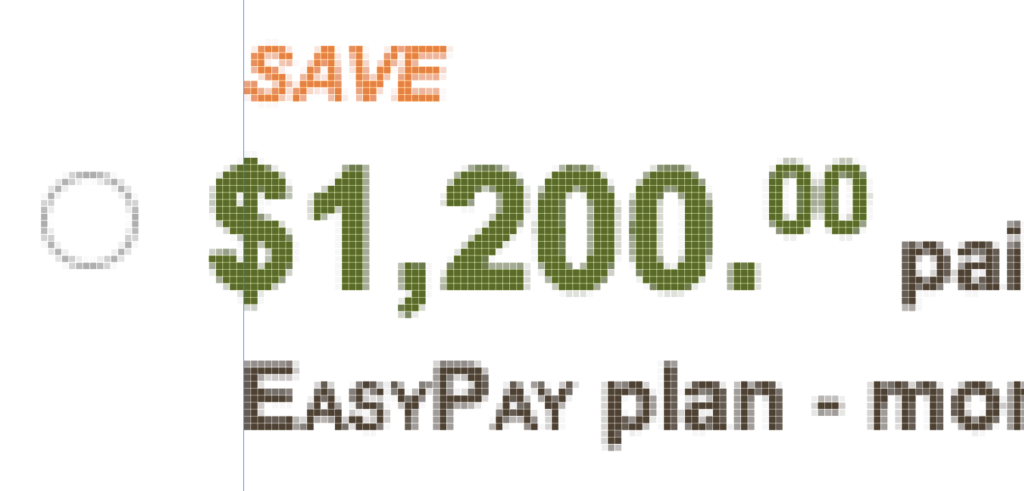
Vertical stroke aligned with margin
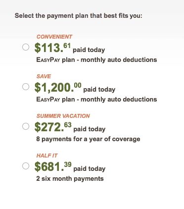
Aligning dollar signs