I’ve been doing a good deal of work recently on website accessibility for pemco.com. I’m about 1/3 of the way into a 9 month push to make PEMCO’s site more accessible to those surfing the web with various abilities. While the topic warrants years of study and volumes of books, some common themes continue the drum’s downbeat.
Inclusive design involves basic, clean markup
Think building an accessible website involves fancy plugins, complex frameworks, experts with Ph.D.’s in H.C.I.? An accessible web involves clean HTML markup that requires attention to detail, much like any markup that makes the web work. Working inclusive detail into a site makes it stronger and more optimized for any user (desktop, screen reader, mouseless, mobile, etc.).
Accessibility and SEO are BFF’s
The work you put into accessible markup benefits SEO and vice versa. Google appreciates your unique title tags just as much as a visitor using a screen reader does. This doesn’t mean they’re one and the same, but there are a good number of accessibility best practices that also help SEO. It’s a nice perk.
It isn’t about being, “compliant.” It’s about trying your best
Many companies begin accessibility initiatives by asking, “Are we compliant?” This question can be translated, “Are we gonna get sued??” I say, who cares? The better questions are, “Does our site serve a wide audience? One that is including all, excluding none? Am I building the best site I can?” Being inclusive is a positive culture shift in any organization, turning you away from the anxiety of covering your ass and aiming you towards the energy that propels progress.
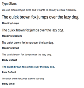 An example is PEMCO’s type sizes. We wanted to present the look and feel of various styles of type very quickly without being bogged down with explicitly outlining each pixel size and font weight (
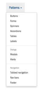 Style guides of the past have been heavy on fonts, colors, and logo treatments. While still important, these things are a given necessity. The real meat and potatoes lies within components; common U.I. elements, how they’re used, and how they’re styled.
 You may not come up with every pattern in a style guide. A framework can not only jumpstart your guide, but it can also offer excellent ongoing, “further reading,” if new and exciting U.I. concepts arrive in the future. I’ve relied on Bootstrap several times for this purpose. There are many