Building the Cave of Wonders for Halloween

At the 2016 Adobe MAX conference, I attended Jessi Arrington’s session on experiential design, a discipline focused on building encompassing environments for people to experience. It got me thinking about the possibilities of mixing tech with a themed environment and before I knew it, I had my 2017 Halloween decorations all planned out.

The Cave of Wonders Halloween porch decorations sketched in Photoshop

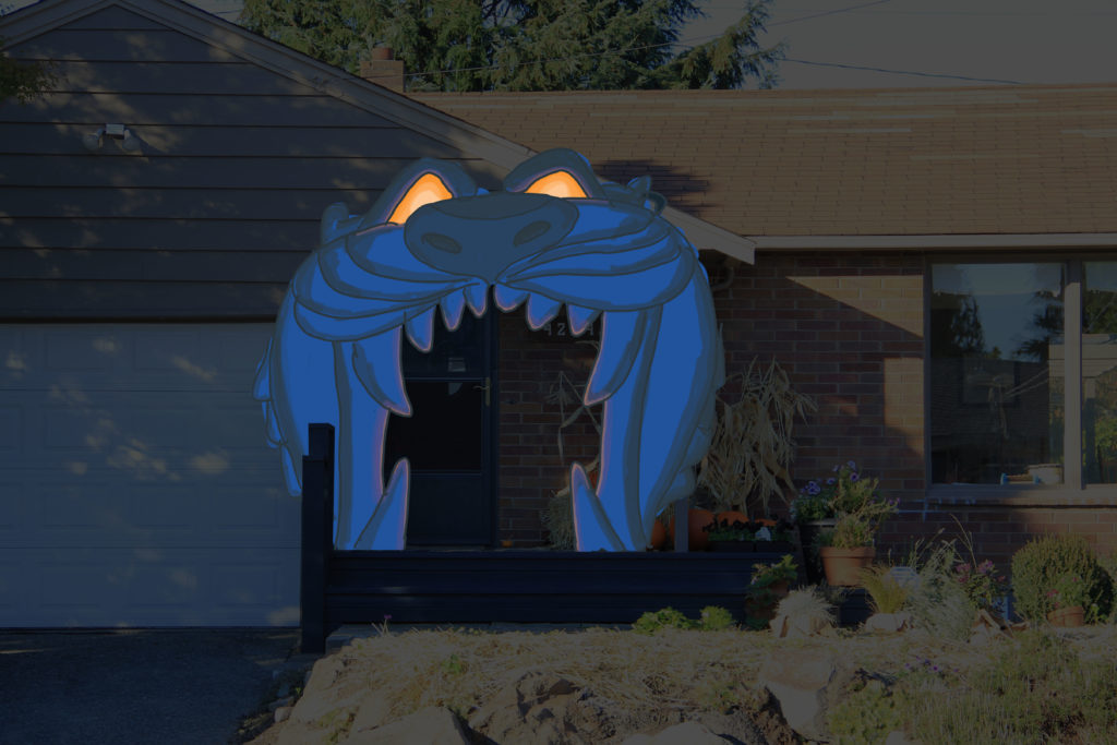
I was going to build Aladdin’s Cave of Wonders on my front porch! Not only was it going to look fantastic, but it was going to contain a Halloween trick. Trick-or-Treaters who dare to enter its mouth were going to be questioned by the Cave, “WHO DISTURBS MY SLUMBER?” If they are worthy, they get to cautiously proceed.

The trick on my end was to pull the concept off. I’ve been a tinkerer for a while now, playing with and learning about Arduinos and Raspberry Pis. They open up multimedia possibilities in a small form factor and at a low price point. With some cheap peripherals (PIR motion sensor and a tactile switch) and various equipment I already had, I was able to construct an immersive experience for all of the boils and ghouls.

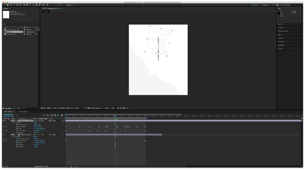
Figuring out the tech was key. At the beginning of October, I built multiple versions of the motion-sensed sound event. I landed on Raspberry Pi over Arduino because of its onboard audio (Arduino offers sound shields, but my soldering technique is sub par!). I used portions of Adafruit’s sitcom SFX door trigger sketch and the knowledge of a friend who codes Python for a living. The motion sensor would tell the Pi there’s motion and the Pi would kick off the Cave’s mp3 via the headphone jack. After the mp3 event, the device would pause and await a reset. The reset was a tactile button on the Pi that I would press after the trick-or-treaters left the porch, ensuring the Cave wouldn’t repeatedly ask, “WHO DISTURBS MY SLUMBER??”

The rest of the tech was simple enough. I mixed looping soundtrack audio (Soundboard Studio Lite for iPad) with the motion sound event via an analog mixer (Rolls MX51s) then fed it into a stereo. The spook tech was set, but it was nothing without the Cave!

I thought through my options for materials and decided to build the Cave out of plywood. Halloween weather is never predictable and I wanted to be ready for rain and wind. Plywood isn’t particularly cheap; a 4’ x 8’ x 3/8” sheet runs about $30. Going thinner makes it cheaper, but it also gets more floppy. Going heavier could be more durable, but makes it harder to lift and mount to the porch. 3/8” worked well for this project.

Cave of Wonders' pieces sketched onto sheets of plywood in Photoshop

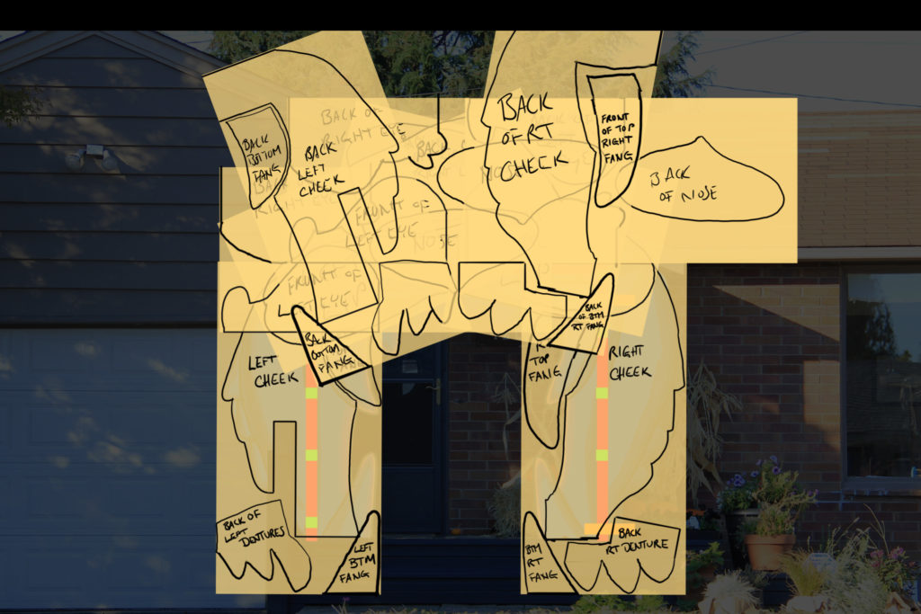
To make the most of my materials, I sketched the pieces onto 4’ x 8’ sheets inside Photoshop, rotating them and playing Tetris until I maximized my canvas, distilling the Cave down to four sheets of plywood. I then took a projector and projected those sketches as stencils onto real plywood, tracing the sketch to surfaces with a marker.

Cutting the wood took awhile, mostly using a jigsaw to get in and around the all of the curves and corners.

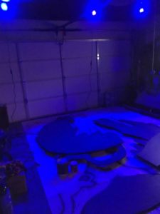
I assembled it, backing it with 2×4’s and 2×6’s. Next was paint. It was to be on display at night under spooky blue flood lamps (10 watt rgb led lamp). When using colored light, your paint behaves differently than in bright light. I had dark blue primer that I decided to use as a base. I chose a teal to add in the detail for the rest of the Cave’s face. I painted under the lights in my garage to know how the final job would turn out.

Painting the Cave of Wonders under dark blue lights.

Almost done! I built out the glowing eyes with white garbage sacks lined with orange mini lights then moved on to installation. I secured a couple of beams under the lip of my porch to serve as the connection to my Cave. The Cave mounted to the porch in two big pieces, the left and right sides, with the nose bridging the gap in the middle. The speakers and motion sensor were hung behind the teeth. The finishing touch was the animated fire light from Home Depot, powered by the porch light.

Last but not least, I made my porch as safe as can be. I already had non-skid strips in place and added hot pink neon tape along the step’s edges to make each step visible. Not pictured, I also outlined the back of the teeth with neon tape. Don’t screw around. Keep it safe!

That is it! In the end, it took about 100 hours to make. Whew! See ya next year.

Quick thoughts on inclusive design

I’ve been doing a good deal of work recently on website accessibility for pemco.com.  I’m about 1/3 of the way into a 9 month push to make PEMCO’s site more accessible to those surfing the web with various abilities.  While the topic warrants years of study and volumes of books, some common themes continue the drum’s downbeat.

Inclusive design involves basic, clean markup

Think building an accessible website involves fancy plugins, complex frameworks, experts with Ph.D.’s in H.C.I.?  An accessible web involves clean HTML markup that requires attention to detail, much like any markup that makes the web work.  Working inclusive detail into a site makes it stronger and more optimized for any user (desktop, screen reader, mouseless, mobile, etc.).

Accessibility and SEO are BFF’s

The work you put into accessible markup benefits SEO and vice versa.  Google appreciates your unique title tags just as much as a visitor using a screen reader does.  This doesn’t mean they’re one and the same, but there are a good number of accessibility best practices that also help SEO.  It’s a nice perk. 

It isn’t about being, “compliant.” It’s about trying your best

Many companies begin accessibility initiatives by asking, “Are we compliant?”  This question can be translated, “Are we gonna get sued??”  I say, who cares?  The better questions are, “Does our site serve a wide audience?  One that is including all, excluding none? Am I building the best site I can?”  Being inclusive is a positive culture shift in any organization, turning you away from the anxiety of covering your ass and aiming you towards the energy that propels progress. 

Posted in Web

I’m headed to Adobe MAX 2016

Hit me up on twitter, @benarson, if you’re at MAX.

Adobe MAX 2016This is my second time to the larger-than-life digital creative conference. I’m stoked to get inspired, humbled, energized, and enlightened. As a web professional, my first MAX in 2014 was heavily focused on web tech. While I’m still looking forward to getting exposure to that (I hope the Adobe XD team has a presence on the pavilion floor), I’ve shaped my itinerary to have a creative bent. I’m overwhelmed by the talent available to see and meet at MAX this year. You can and should check out the live streams available on max.adobe.com. Maybe you’ll see me waving at the cameras. Here’s where you’ll find me:

WEDNESDAY 11/2

9:30 AM – The Big Keynote

Probably some product reveals presented by Adobe CEO Shantanu Narayen. If Adobe is going to have a big giveaway, this is where it happens. My prediction? Probably a nice media-capture device, like a camera, hopefully a 360 camera. My wish? Tim Cook makes an appearance to giveaway new Macbook Pros. One can dream.

1:45 PMPretty Much Everything: Aaron Draplin

The quick-fire casually polished presentations by Aaron James Draplin of the Draplin Design Co. warm my heart. His work-your-ass-off ethic via his passion for good design clears minds of the noise and gets eyes to see the best in things. I’m bringing cash to buy some merch from his table because cash is king.

3:30 PMTen Designers That Changed My Life: Nick Sambrato

I know of Nick’s awesome print shop, Mama’s Sauce, and I don’t think this topic is going to fail. Lay it on me, Nick.

5:15 PMThe Difference Between Being Cute & Being Creepy Is One Emoji: Timothy Goodman

I have no idea what he’s going to talk about, but it should be both entertaining and insightful. Timothy is a very talented illustrator who’s collaborated with many other gifted designers. Pumped to hear this talk.

6:30 PMSponsor Night

There should be keynote presenters here showing off the latest Adobe tech. I’m excited to meet these experts in person and ask them questions one-on-one. Also, mingling with like-minds. Also also, apps+snacks+beer.

THURSDAY 11/3

8:15 AMEverything Your Mother Never Told You About Launching a Product Line: Rebecca Simpson

I don’t have any plans to make physical products at the moment, but I find the whole process fascinating (probably why I like Draplin so much). Looking forward to hearing a good story and some nuggets of knowledge from Becky.

10:00 AMSecond Keynote

This keynote features rockstar creatives making it happen in big ways. Scheduled to attend this year is artist Janet Echelman, fashion designer Zac Posen, photographer Lynsey Addario, and some filmmaker named Quentin Tarantino. This keynote usually involves inspiration overload.

12:45 PMTelling My Stories, My Way: My Journey to Becoming a Self­Made Artist: Josiah Brooks

Josiah from Jazza Studios is a high-energy speaker. It should be full of positive vibes from a person making a buck from his passions.

2:30 PMMasters of None: The Made Shop

I’ve been a generalist in nearly every job I’ve been paid for. This title speaks to me. Sounds like the entire Made Shop is going to be there.

6:00 PMMAX Sneaks

Keegan-Michael Key to offer witty banter alongside some of the craziest late-breaking tech from Adobe engineers? GOLD.

7:30 PMMAX Bash

The Mogli’s and the Alabama Shakes will rock among performance artists and fancy appsnacks. I saw the Alabama Shakes in Seattle the week after their appearance on Saturday Night Live. It was amazing and loud, even from the back row. I’ll be trying to get closer to the stage this go around.

FRIDAY 11/4

8:30 AM Crafting the Story: Storytelling Techniques That Capture the Audience: Christine Steele

I do a lot of work with user experiences. When outlining a journey online, with an interface, and, of course, in a seat at the movie theater, a story arc is essential to engagement. I’m interested in Christine’s take on storytelling.

10:15 AMUsers Are People Too: Meagan Fisher

Humanizing user experiences is a big deal all over the web and especially challenging in my current gig (web design for insurance). Meagan’s talk feels close to home.

12:45 PMYou Don’t Have to Start with a Good Idea — You Just Have to Finish with One: Dan Stiles

Dan hails from the PNW, he’s an excellent illustrator, and he’s speaking at MAX. I’m there.

2:30 PMAdventures in Experiential Design: Jessi Arrington

I am very, very excited about this talk. I once spent a summer driving boats around and around Disneyland’s Jungle Cruise. It goes without saying, it was a fun job that a lot of people would do for free (I did it for minimum wage), but the main benefit for me was being immersed in virtual realities designed and built for in-person experiences. Jessi designs these kinds of experiences for pop-up shops, conferences, and other themed environments.

4:15 PM What the Future Holds for Video Creatives: Dave Werner

I’m waitlisted on Dave’s character animation labs, so this session will have to do! I love video and I am pumped to hear from Dave, someone who routinely churns out cool video content. Great way to end MAX and look to tomorrow.

Making a Digital Style Guide a Success

PEMCO Insurance is currently experiencing a renaissance, bringing levels of service to its customers that they’ve never before seen. In my short tenure (4.5 years) at PEMCO, we’ve added online access to policies, amendments, payment plans, documents, the ability to go paperless, an any-device responsive website, iOS and Android apps, among other fast and efficient features that provide direct access to PEMCO and their products.

It’s all quite exciting on the surface, but there’s also a ton of moving parts under the hood. Internal applications that drive the business and feed data to various systems are being retooled to be the most effective they can be.  These challenges arrive at my desk in the form of usability and interface design tasks. 

As all of these internal apps do different things and serve multiple departments, their connection to PEMCO can get off-the-rails a bit. Brand styles and patterns start to look and behave completely different depending on where you work. PEMCO has recognized this issue and has moved to adopt not only the organization’s brand standards, but also to go further and agree on digital style standards to bring its many tools into familiar territory, allowing users to get working rather than wasting time getting accustomed to new user interfaces when they switch apps. 

My team took to the task and produced a style guide that was very well received by PEMCO in a short period of time. The (soon to not be) secret to our success lies in these lessons learned:

– Keep your audience in mind at all times

Take shortcuts in your writing when you can assume your readers already understand a concept, but always keep asking yourself if your audience will comprehend and be comfortably guided by what you’re trying to communicate.

type sizes
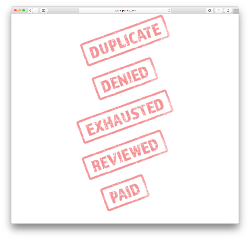
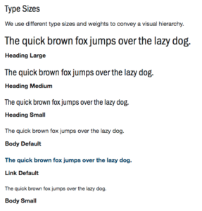
An example is PEMCO’s type sizes. We wanted to present the look and feel of various styles of type very quickly without being bogged down with explicitly outlining each pixel size and font weight (the H1 is 20px, the H2 is 16px, the H3 …). Relying on the audience’s knowledge (developers) to inspect the document for CSS specifics, this approach worked for both tech and non-tech inclined and we found our audience’s sweet spot for detail. 

– Fonts and colors are great, but what your developers need are patterns.

patterns
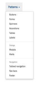
Style guides of the past have been heavy on fonts, colors, and logo treatments. While still important, these things are a given necessity. The real meat and potatoes lies within components; common U.I. elements, how they’re used, and how they’re styled.

– Adopt a framework to fill in the gaps

Bootstrap iconYou may not come up with every pattern in a style guide. A framework can not only jumpstart your guide, but it can also offer excellent ongoing, “further reading,” if new and exciting U.I. concepts arrive in the future. I’ve relied on Bootstrap several times for this purpose. There are many other frameworks to consider.

Aligning money

I’ve been drawing big dollar signs lately and I’ve found a little alignment trick that I feel makes a list of currency values look better. Path-to-completion is always on my mind when building a web form and when I was tasked to design a list of payment plans, something wasn’t sitting right with the dollar signs I placed on the page. I threw in a little negative margin-left to the dollar amount, bringing the dollar sign’s vertical stroke inline with the gutter and the result is clean and crisp.  
 
Vertical stroke aligned with margin

Vertical stroke aligned with margin

 
Aligning dollar signs

Aligning dollar signs

Slider accompanied by accessible dropdown

This isn’t a new idea on the web, but I found the details of a solution to my particular challenge spread out over the net, so I’ll consolidate my findings here.  
 
Ugly dropdown

Ugly dropdown

The task was to make an ugly dropdown of values look better. Immediately I went into mobile-first mode and thought of a slider, but sliders have always been a sticking point for accessible browsers. After poking around, I found a stackexchange thread that suggested linking a slider alongside an accessible input (text field or dropdown). I liked the approach; I wouldn’t be eliminating the dropdown in the name of accessibility, but if you’re down (haha) with using the slider, you won’t open the dropdown and see the long list of values hidden within. Also, the double-up on UI will benefit each other, with the dropdown displaying a more specific value of where you are on the slider’s spectrum. The approach is full of win.  
 
Slider with dropdown

Slider with dropdown


I liked how RangeTouch worked in a majority of browsers and linked it to a regular dropdown. Here it is in action:  
 

See the Pen Accessible slider by Brent Enarson (@benarson) on CodePen.


Posted in Web

Making a diamond ellipse with just CSS

Diamond ellipses are one of my favorite shapes. It’s a strong take on a square that’s a throwback to the shape of tube TV’s.

Diamond Ellipse

I recently tried using a SVG clip path to turn a Google Maps image into a diamond ellipse. It worked for the latest browsers, but fell apart on IE11. For the sake of progressive enhancement, I was OK with the map going square on IE11.

However, this SVG clip path lived on a bootstrap page that contained a checkbox button group and adding the SVG code made the button group disappear! With no time to debug the thousands of lines of bootstrap.css and .js, I sought another solution. What I came up with allowed me to bypass a large edit of the styles and opened up IE11 to the diamond ellipse. Score!

Score!

I used a fun CSS border-radius trick to draw the horizontal sides of the ellipse, then I stacked another div of the same image on top of the first with its vertical sides defined for the ellipse.

Building a diamond ellipse

The CSS property border-radius can bend a div’s side by throwing a slash into the specified radiuses, like so:

.map-A {
  border-radius: 80px/30px; /* horizontal radius/vertical radius */
}

The whole thing comes together like so:

See the Pen CSS diamond ellipse by Brent Enarson (@benarson) on CodePen.


Butabi bros

Ink stamp effect using CSS and fonts

I did something fun, quick, and (fairly) light today. The request was for some ink stamps that are going to go over images of bills on a webpage. Typically, I’d mock up some stamps, reduce the alpha, and save to PNG. But since there were so many stamps (5 at this time, more to come), I wrote them up in CSS. This first version was very lightweight. I used a font that was already on the site, then used all sorts of CSS to produce stamp ink. I took advantage of opacity, transform: rotate, and filter: blur.
Pure CSS ink stamps

Pure CSS ink stamps

Then the request came back for a grungy font. That’s easy to do with Adobe Typekit. What isn’t entirely easy to do is carry that grunge on through to the div’s border. I accomplished this by spinning up a single grungy PNG that utilized the border-image property. Yes, I dipped into images, but it’s one image for any combination of stamps, vs multiple custom images. Check out the source of the links for all of the markup.
Grunge ink stamps made of CSS

Grunge ink stamps made of CSS

Quick GIF for a 404 screen

One of my PEMCO teams needed an error screen. Being an insurance company, I put together this tumbling car for a 404 error.
404 tumbling car

404 tumbling car

Making the gif was quick, but it involved many tools to pull off. I first drew the assets in Illustrator (hillside and car), moved them to a canvas in Photoshop to figure out the math of the animation (the X and Y of the hillside), then I made a comp in After Effects. After getting a MOV file I liked, I finally moved that back to Photoshop to optimize a gif (it’s still a little large at 500kb).
Tumbling car in After Effects

Tumbling car in After Effects

It turned out pretty cool! If making GIFs in After Effects, don’t forget to turn on motion blur; it makes everything look better and allows you to cut more frames out of your final GIF. Check it out in action:
Claim Portal 404

Claim Portal 404