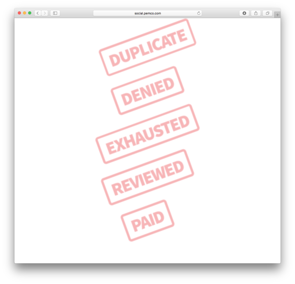
Ink stamp effect using CSS and fonts
I did something fun, quick, and (fairly) light today. The request was for some ink stamps that are going to go over images of bills on a webpage. Typically, I’d mock up some stamps, reduce the alpha, and save to PNG. But since there were so many stamps (5 at this time, more to come), I wrote them up in CSS.
This first version was very lightweight. I used a font that was already on the site, then used all sorts of CSS to produce stamp ink. I took advantage of opacity, transform: rotate, and filter: blur.
Then the request came back for a grungy font. That’s easy to do with Adobe Typekit. What isn’t entirely easy to do is carry that grunge on through to the div’s border. I accomplished this by spinning up a single grungy PNG that utilized the border-image property. Yes, I dipped into images, but it’s one image for any combination of stamps, vs multiple custom images. Check out the source of the links for all of the markup.


