I do a lot of quick UI mocks and prototypes for PEMCO Insurance. Here’s one.
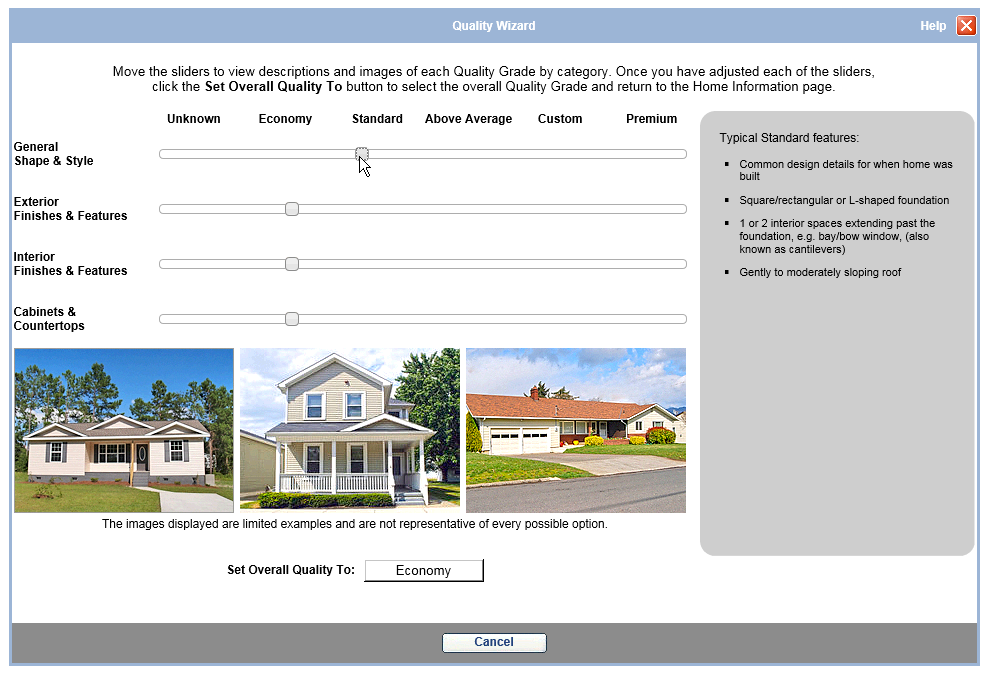
We received a home valuation tool from a vendor. It had some useful features, but arrived with some rudimentary UI that would terribly slow down form completion and muddy the UX.
Beauty, eh?
I was tasked with making this better and available to our users on pemco.com. Using a mobile-first approach, sliders actually can be really useful (
I just had a flashback to reading Thomas the Tank Engine to my son …) on phones and tablets, however, they are most useful when letting someone define a range (
rate this on a scale of one to ten, how much is your package worth, how many in your party). When the options are clearly defined (economy, standard, above avg, etc.) and they have a clear step, the slider starts to lose its purpose. A selector bar would work nicely, but the labels are a little too long. I thought a stepping carousel would work and look well.
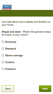
While clean and elegant, this approach is not accessible to screen readers. A radio button menu will still look good, offer the accompanying help text, and be accessible to all users.
-
-
Standard radio group
-

-
Radio selected
-

-
Select homes as radio buttons
-

-
Select homes as buttons selected