Diamond ellipses are one of my favorite shapes. It’s a strong take on a square that’s a throwback to the shape of tube TV’s.

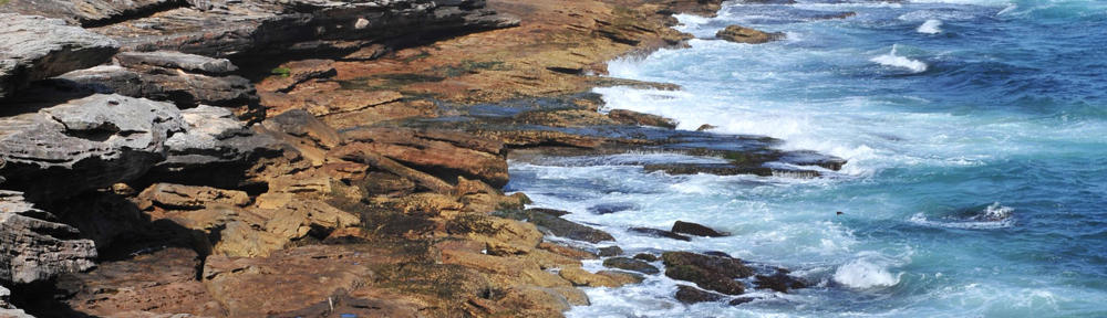
I recently tried using a SVG clip path to turn a Google Maps image into a diamond ellipse. It worked for the latest browsers, but fell apart on IE11. For the sake of progressive enhancement, I was OK with the map going square on IE11.
However, this SVG clip path lived on a bootstrap page that contained a checkbox button group and adding the SVG code made the button group disappear! With no time to debug the thousands of lines of bootstrap.css and .js, I sought another solution. What I came up with allowed me to bypass a large edit of the styles and opened up IE11 to the diamond ellipse. Score!

I used a fun CSS border-radius trick to draw the horizontal sides of the ellipse, then I stacked another div of the same image on top of the first with its vertical sides defined for the ellipse.
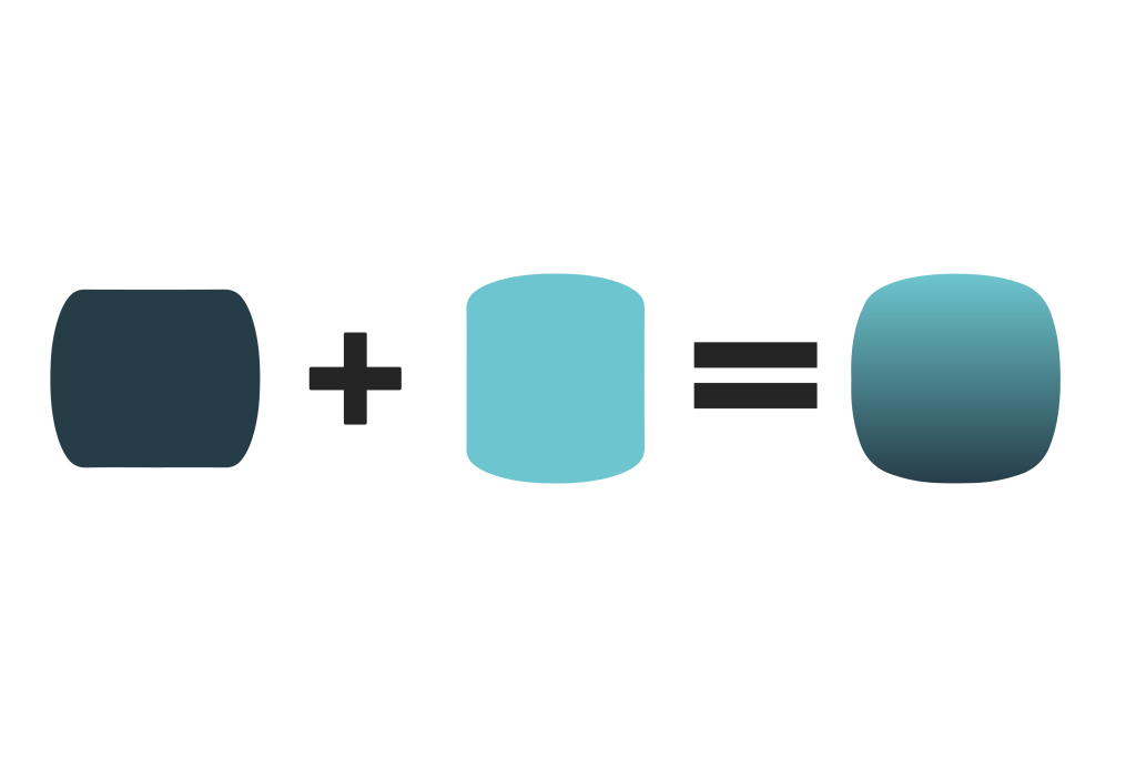
The CSS property border-radius can bend a div’s side by throwing a slash into the specified radiuses, like so:
.map-A {
border-radius: 80px/30px; /* horizontal radius/vertical radius */
}
The whole thing comes together like so:
See the Pen CSS diamond ellipse by Brent Enarson (@benarson) on CodePen.