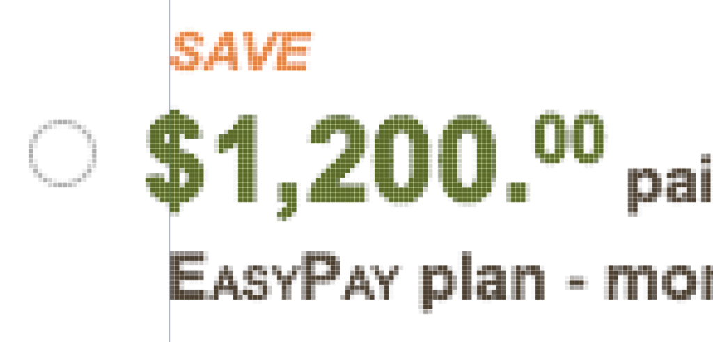
Vertical stroke aligned with margin
Aligning dollar signs
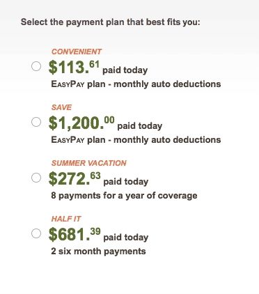
Vertical stroke aligned with margin
Aligning dollar signs
Diamond ellipses are one of my favorite shapes. It’s a strong take on a square that’s a throwback to the shape of tube TV’s.

I recently tried using a SVG clip path to turn a Google Maps image into a diamond ellipse. It worked for the latest browsers, but fell apart on IE11. For the sake of progressive enhancement, I was OK with the map going square on IE11.
However, this SVG clip path lived on a bootstrap page that contained a checkbox button group and adding the SVG code made the button group disappear! With no time to debug the thousands of lines of bootstrap.css and .js, I sought another solution. What I came up with allowed me to bypass a large edit of the styles and opened up IE11 to the diamond ellipse. Score!

I used a fun CSS border-radius trick to draw the horizontal sides of the ellipse, then I stacked another div of the same image on top of the first with its vertical sides defined for the ellipse.
The CSS property border-radius can bend a div’s side by throwing a slash into the specified radiuses, like so:
.map-A {
border-radius: 80px/30px; /* horizontal radius/vertical radius */
}
The whole thing comes together like so:
See the Pen CSS diamond ellipse by Brent Enarson (@benarson) on CodePen.

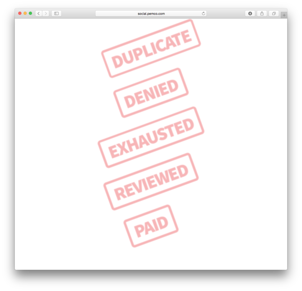
Pure CSS ink stamps
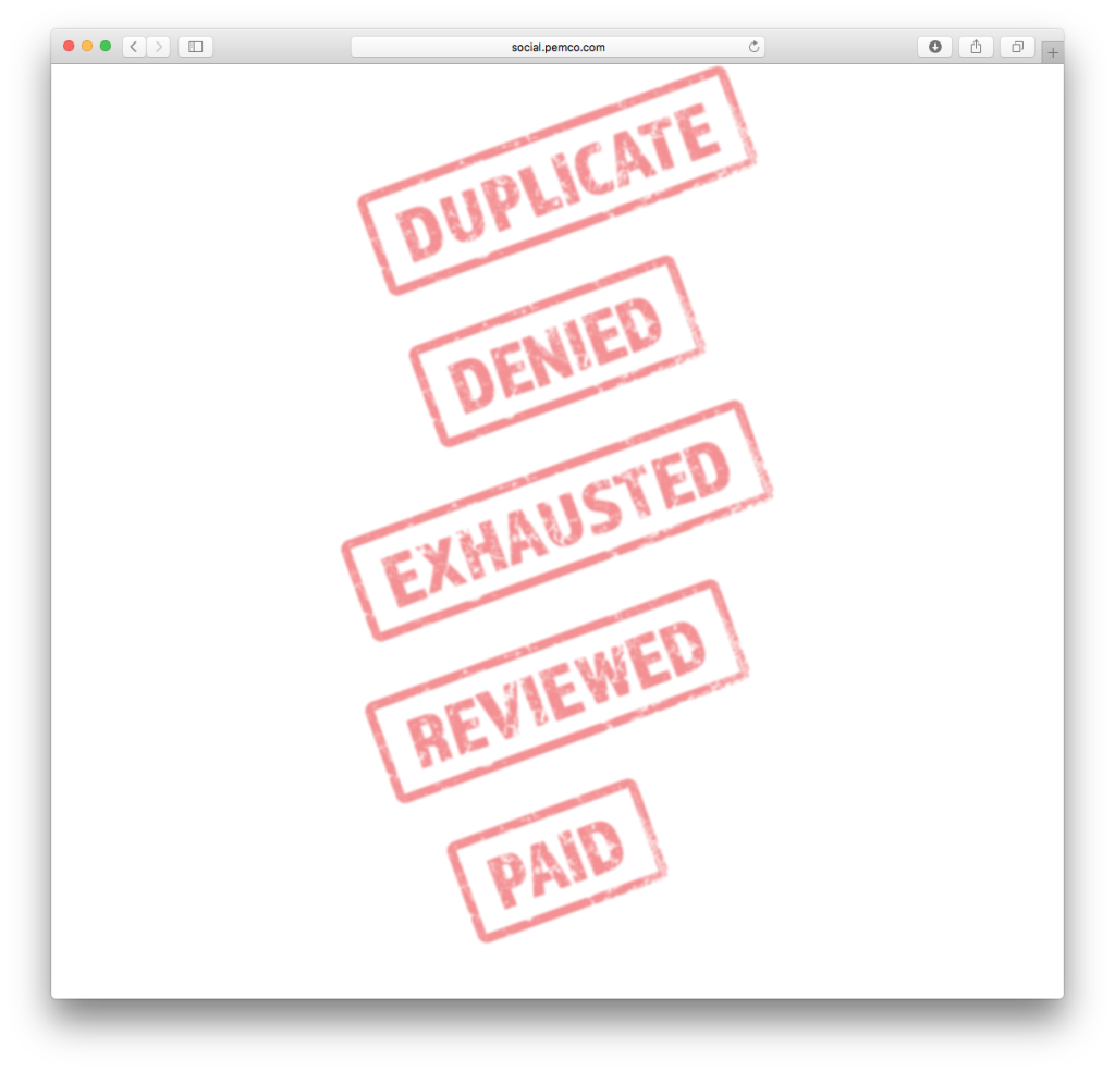
Grunge ink stamps made of CSS

404 tumbling car
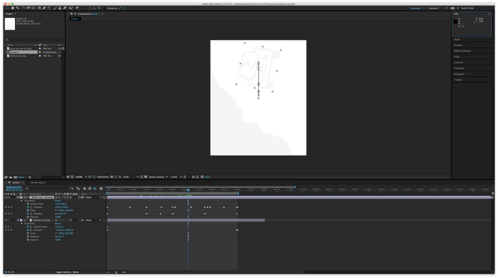
Tumbling car in After Effects
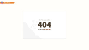
Claim Portal 404
When using artboards in Photoshop, your canvas appears white. On a regular PSD, this would be a blank white layer, but on artboards it is a blank transparent slate. Nothing is inside the artboard group. When sharing your PSD via Adobe Extract, you get a big, empty, hard to see canvas.
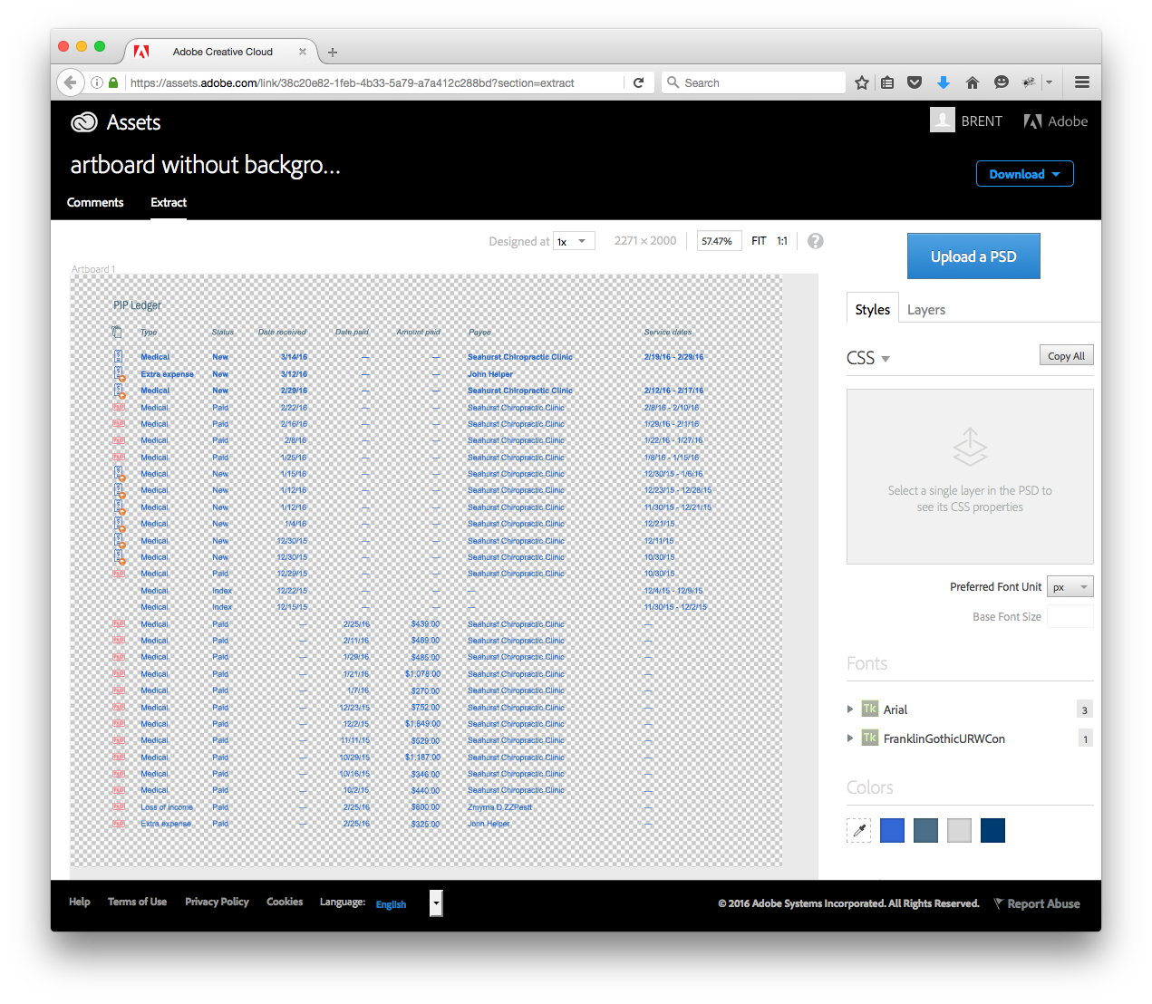
There are times when displaying the transparent alpha in your comp makes sense, but I find that most of the time, sharing artboards with blocks of transparency looks poor and is hard to work with.
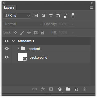
My best practice: place a shape layer as a background. It doesn’t have to be precise, it just needs to cover the entire artboard. Remembering this simple step produces clean comps for your developers to Extract!