Place a background layer on your Photoshop artboards

When using artboards in Photoshop, your canvas appears white. On a regular PSD, this would be a blank white layer, but on artboards it is a blank transparent slate. Nothing is inside the artboard group. When sharing your PSD via Adobe Extract, you get a big, empty, hard to see canvas.

Extracted psd artboard without background

There are times when displaying the transparent alpha in your comp makes sense, but I find that most of the time, sharing artboards with blocks of transparency looks poor and is hard to work with. 

Background layer in PSD artboard

My best practice: place a shape layer as a background. It doesn’t have to be precise, it just needs to cover the entire artboard. Remembering this simple step produces clean comps for your developers to Extract!

Remove scrap artboards using InVision’s Photoshop layer sync

InVision app’s layer sync for Photoshop PSD’s has been around for awhile and was my go-to for isolating layer groups when moving comps from Photoshop to InVision. I’m all in on PS artboards and my workflow has adapted since the introduction of artboards. Using “+” in front of layers and groups is no longer necessary, since every artboard is automatically added. I do make use of “-“, though. I often set up a page template artboard that I’ll never want to display in InVision. Simply add a minus to the front of an artboard, and InVision will omit the artboard from your prototype.

Minus in front of PSD artboard

More on Photoshop layer syncing from InVision.

Are Photoshop smart objects worth it?

Smart objects are great! Right? Come on, are you with me? The entire Adobe community agrees that they are a best practice; use smart objects and your wildest dreams will come true.
Smart object icon

Smart object icon – weeee!

Sure, it’s a single reference that can be changed once to make sweeping affects on your psd’s. If you have a logo file and you’re copying it across multiple page comps, by all means, you should make it a smart object and copy from that.  Need to change the logo? Edit one. Edit all. Rule the world.
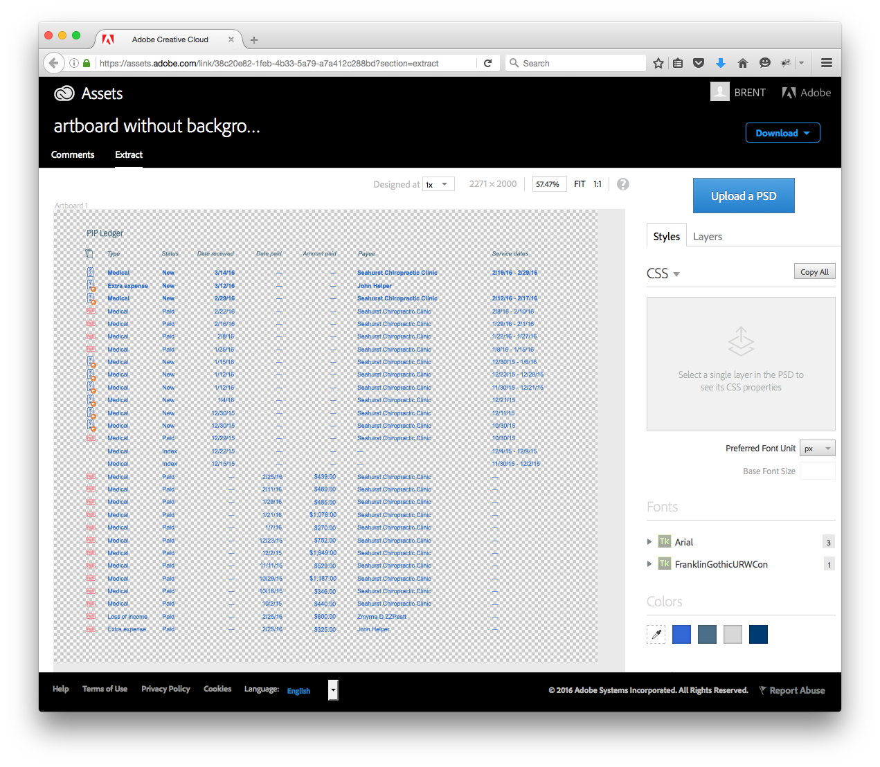
 Extract But let’s talk about one particular workflow that isn’t working for me. I use Adobe Extract a lot. Extract is awesome; it’s Dropbox plus a PSD inspector that allows me to share comp details with clients, developers, friends, family, etc. It’s been around since 2014. Extract is wonderful and I love it. Creative Cloud Extract Extract is a complicated feat by Adobe. Basically, I’m uploading a PSD to the cloud (I’m pretty sure it’s hosted on Amazon Web Services) and it waits there for you to check it out. When you come along, it grabs the PSD and goes to town, rendering all of the layers, doing all sorts of math for you, gathering data on font families, sizes, colors, etc., etc., etc. Extract does all of this online, inside your browser, without the need to download, license, and run Photoshop. Amazing.
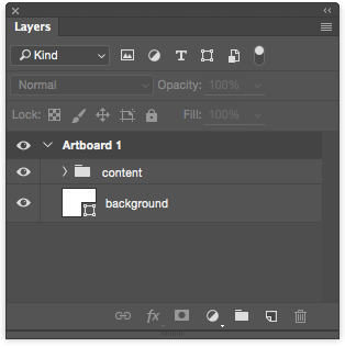
 Artboards Photoshop CC 2015 brings artboards to PSD’s. Now, instead of doing an insane amount of layer groups or layer comps (which I always got lost in), you can now lay out all of your comps as artboards across one PSD. The experience is killer and clear and especially amazing when dropping PSD’s into InVision.
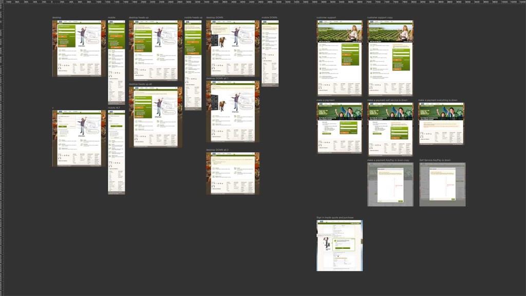
 
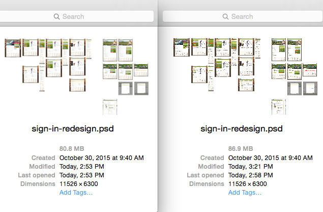
I’ve been loving artboards since day one. Then, like with many new things, that love can begin to wane. I noticed my files getting huge, roughly 5 MB per artboard. It would kind of bother me seeing a PSD approach 50 MB, 250 MB, once 500 MB, but I wouldn’t let it get me down. I’m a professional! I’ll swing through my PSD later when I have some time, clean it up, optimize some things, and feel better about myself. No big deal. Artboards + Extract Hey, let’s check out one of my multi MB PSD’s on Extract . . . holy nuts. The render time, while I wouldn’t classify it as, “forever,” takes some time. And it makes sense, right? I’ve handed some server on the cloud the task of rendering layers and layers of information, on demand. But, shoot, this is really slow. Don’t get me started on the unfortunate reality that not everyone I share links with runs the latest version of Chrome on a fast internet connection. That render gif? They stare at that thing for many minutes before writing me a nasty email. Extract rendering I quickly arrive to the conclusion that I should do my due diligence in optimizing these PSD’s and what better way can I reduce file size and hopefully improve Extract’s performance than with smart objects? Everybody is doing it. Come on, you know you want to. Smart objects I spend a little too much time thinking through my PSD. I do all of the basic stuff (“Oh, I use that icon more than once … smart object!”). I even do some deep cuts, nesting smart objects. My pages are consolidated like a defragmented hard drive. Things are looking goooooood.
File size climbs

File size climbs

It’s the funniest thing, my file size? With single references for multiple objects on my artboards, my PSD file size actually goes up! What?? Yes!! Unbelievable, I know, but my theory is, smart objects make Photoshop think harder and when you start creating them all over the place your file size will initially step up. Now, from my understanding, the more I copy that referrence, the more my work pays off. With the file I’m currently gabbing about, it contains about 20 artboards. If the PSD were to contain 100 artboards, then the smart object starts to pay off hand over fist. It’s like investing money or buying wheat futures or  . . . whatever, I’m terrible at analogies. You get the picture. Alright, so smart objects are kind of screwing me at the moment. Do they make Extract perform any better? It doesn’t feel like it. Well, how about doing the thing that no Photoshopper likes to do, and flatten my smart objects? You can do this – and it will reduce file size, but at what cost? Flattening smart objects is dumb. It saved me about 15% on the PSD in question and ruined Extract. Even before flattening the objects, Extract doesn’t allow inspection of smart objects (yet). Want a developer to lift some CSS or simply see what font-family that word is? Forget it. Extract requires things like fonts, shapes, layer styles, and the like to be on their own layers to be inspected. Lock it into a smart object and that Extract feature dies. So, are smart objects in Photoshop worth it? I think if I need to repeat a raster image that doesn’t require layer styles (box shadow or something) then I’ll keep up with using smart objects. However, if I have something that has multiple shapes, fonts, and layer styles, I’m not going to count on smart objects doing me any favors. Luckily, Adobe seems to care about improving Photoshop and Extract features. Join the Adobe Forums and get your ideas in the hands of Adobe developers.

Replacing slider UI with carousel, radio buttons

I do a lot of quick UI mocks and prototypes for PEMCO Insurance. Here’s one. We received a home valuation tool from a vendor. It had some useful features, but arrived with some rudimentary UI that would terribly slow down form completion and muddy the UX.
Vendor Quality Wizard

Beauty, eh?

I was tasked with making this better and available to our users on pemco.com. Using a mobile-first approach, sliders actually can be really useful (I just had a flashback to reading Thomas the Tank Engine to my son …) on phones and tablets, however, they are most useful when letting someone define a range (rate this on a scale of one to ten, how much is your package worth, how many in your party). When the options are clearly defined (economy, standard, above avg, etc.) and they have a clear step, the slider starts to lose its purpose. A selector bar would work nicely, but the labels are a little too long. I thought a stepping carousel would work and look well. While clean and elegant, this approach is not accessible to screen readers. A radio button menu will still look good, offer the accompanying help text, and be accessible to all users.

ESPN College GameDay Sign Rules & Regulations

How to make the perfect ESPN College GameDay sign and get on TV

After a close 31-28 loss to #5 Stanford, the #15 University of Washington Huskies were to host the #2 ranked Oregon Ducks at the newly renovated Husky Stadium in Seattle, WA.  Excitement for the neighbor state rivalry was at an all-time high with enthusiasm of a potential upset in the air.  This level of energy did not go unnoticed by the national audience, bringing ESPN College GameDay to the UW campus for the first time.

When GameDay is announced to visit your school, you have less than a week to prepare and participate in the best part of the show; making a funny and noticeable GameDay sign. Once announced on ESPN’s twitter feed, I got crackin’ and came up with 6 signs for display during the October 12, 2013 broadcast.

This slideshow requires JavaScript.

In very little time, I designed and constructed 6 signs, two of which made Sports Illustrated’s list of best GameDay signs for week 7.  It was a lot of work, but a ton of fun.  Here are my tips to make your GameDay signs a smashing success.

Follow the rules

ESPN doesn’t post rules beforehand, but there were plenty of them once we arrived to the GameDay broadcast.  They are:
  1. No political signs – You may want everyone to vote for Pedro, but ESPN doesn’t want to broadcast it.
  2. Nothing vulgar – Rule of thumb, if you wouldn’t show your sign to your Grandma, don’t bring it to ESPN College GameDay.
  3. No .COM signs – This one kinda screwed me.  I had a funny .COM sign, but it didn’t get much use thanks to this rule.
  4. No effigies – Goes under the nothing vulgar rule.  Lynch mobs weren’t funny in the 50’s and they’re not amusing now.  Find a better joke.
  5. Keep it safe – Don’t duct tape yard sticks together to hold your giant heavy flag 30 feet overhead of a packed crowd.  See my set up below for a lightweight, tall, and safe setup.

Constructing large, visible signs

After you have a fun, quirky, and unique sign idea, it’s time to construct a practical set up that is easy to carry and visible to the crowd and ESPN cameras.  My set up included:
  1. Foamcore – remember, this sign is only for the day, so no need to build it out of wood (like some people do!).  A large piece of poster-sized foamcore is a great foundation to a good GameDay sign.
  2. Extending pole – I picked up affordable 20 foot long poles off of Amazon.  They were super light and very easy to use.  These poles made my signs some of the tallest at ESPN College GameDay.  Protip: give the pole’s seams a strong pull and twist, ensuring that they stick and stay put.  For added security, apply a piece of duct tape to the seam.
  3. Gorilla tape – Gorilla is the strongest duct tape you can buy, keeping your sign affixed and steady.  I secured my signs to poles with Gorilla tape and they stayed put throughout the 3 hour long ESPN GameDay broadcast.

Other GameDay sign tips

  1. Watch for wind – Many GameDay participants (and two WSU Cougars) will bring flags.  They are your indication for which way the wind is blowing.  Observe and be mindful of this for safety’s sake.  Turn your sign parallel to the wind during gusts and bring your signs down when losing a battle with the wind.
  2. Get there early – My group showed up 2.5 hours before the broadcast and was still a ways back from the stage.  We still got a good spot, though, leading me to my next tip…
  3. Look for the skycam – My Group was fairly far from the GameDay stage, but we had a great time hanging out near the path of the skycam cable.  My signs got great airplay during sweeping crowd camera shots.
  4. Bring coffee – Duh.
  5. Make noise – Cheer, yell, sing the fight song, etc.  ESPN loves school spirit!